
THE CLIENT
Chasing invoices sucks, let's fix that.
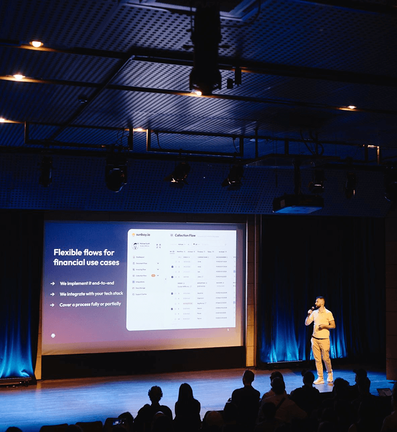
Sunaby transforms your financial processes by providing end-to-end automation experience with low entry barrier implementation. Sunbay's clients can improve their cash flow management, spend less time on repetetive tasks and gain more visibility and control.
THE CHALLENGE
Like many early-stage companies, Sunbay faced a classic challenge: they had a promising product, but no clear way to communicate what it really stood for. Previous attempts at in-house branding didn’t quite manage to capture the unique mix of personalities and ambitions behind the company. On one hand, Sunbay deals with serious topics - financial processes, debt collection, and cash flow optimization for both SMBs and larger enterprises. But on the other hand, the team behind Sunbay isn’t your typical finance crew. They’re energetic, spirited, and deeply focused on making people’s lives easier through automation - not on playing the part of stiff, suit-wearing “finance guys.” Their name, Sunbay, and their earlier visual identity leaned heavily into a breezy, tourism-like aesthetic - something that didn’t quite match the power and utility of the product. The challenge was to strike the right balance between their vibrant team energy and the seriousness of their financial tech solution, all without losing authenticity or falling into generic fintech tropes.
THE SOLUTION
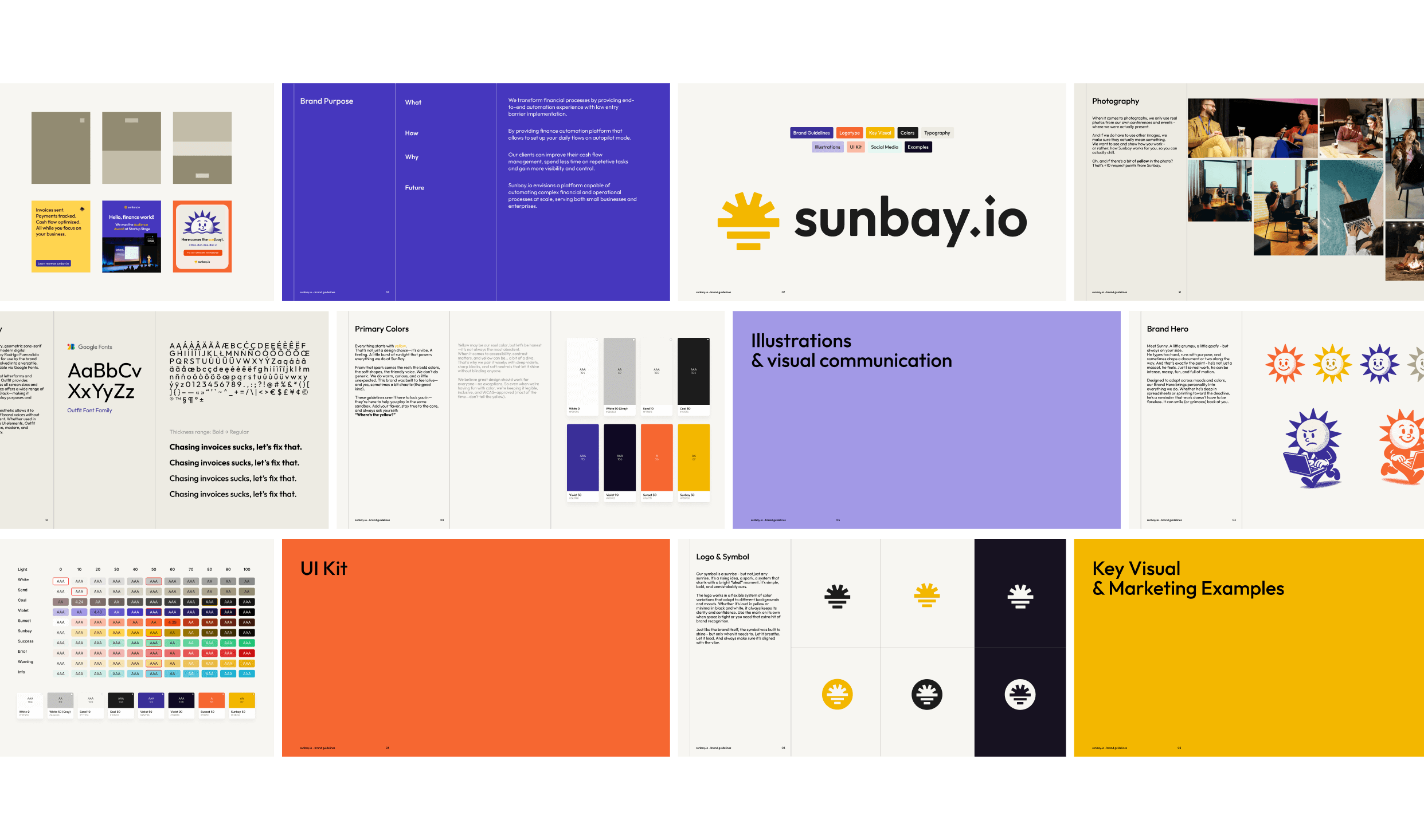
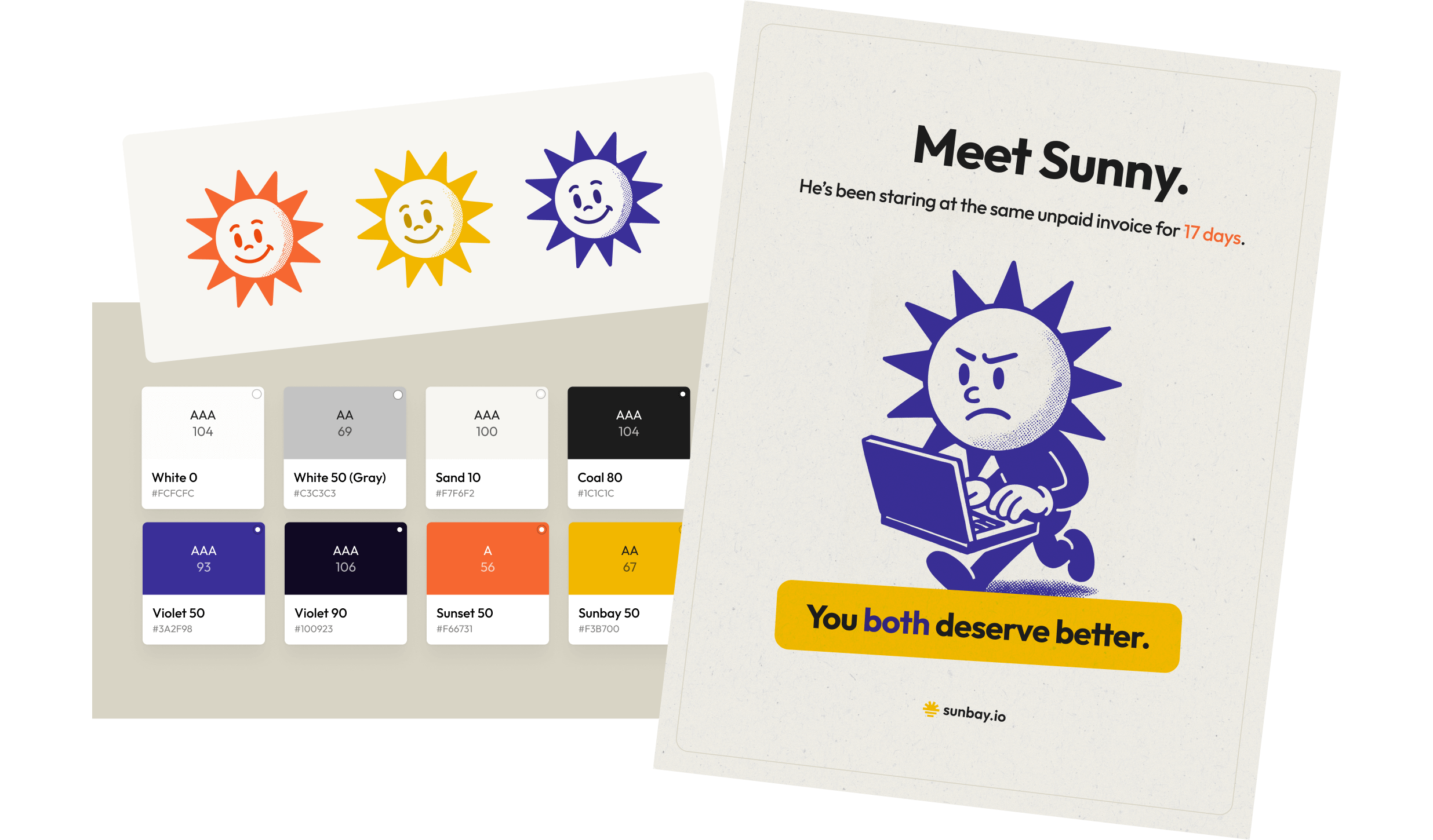
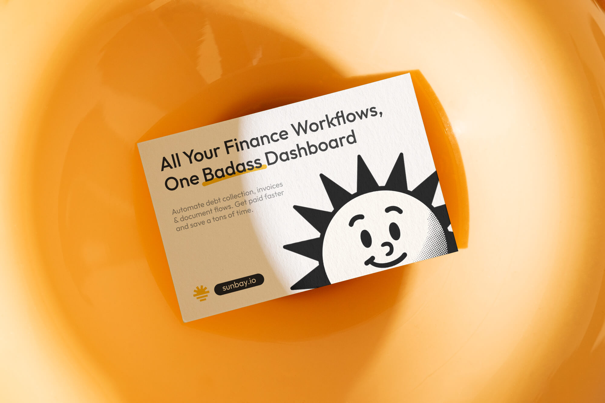
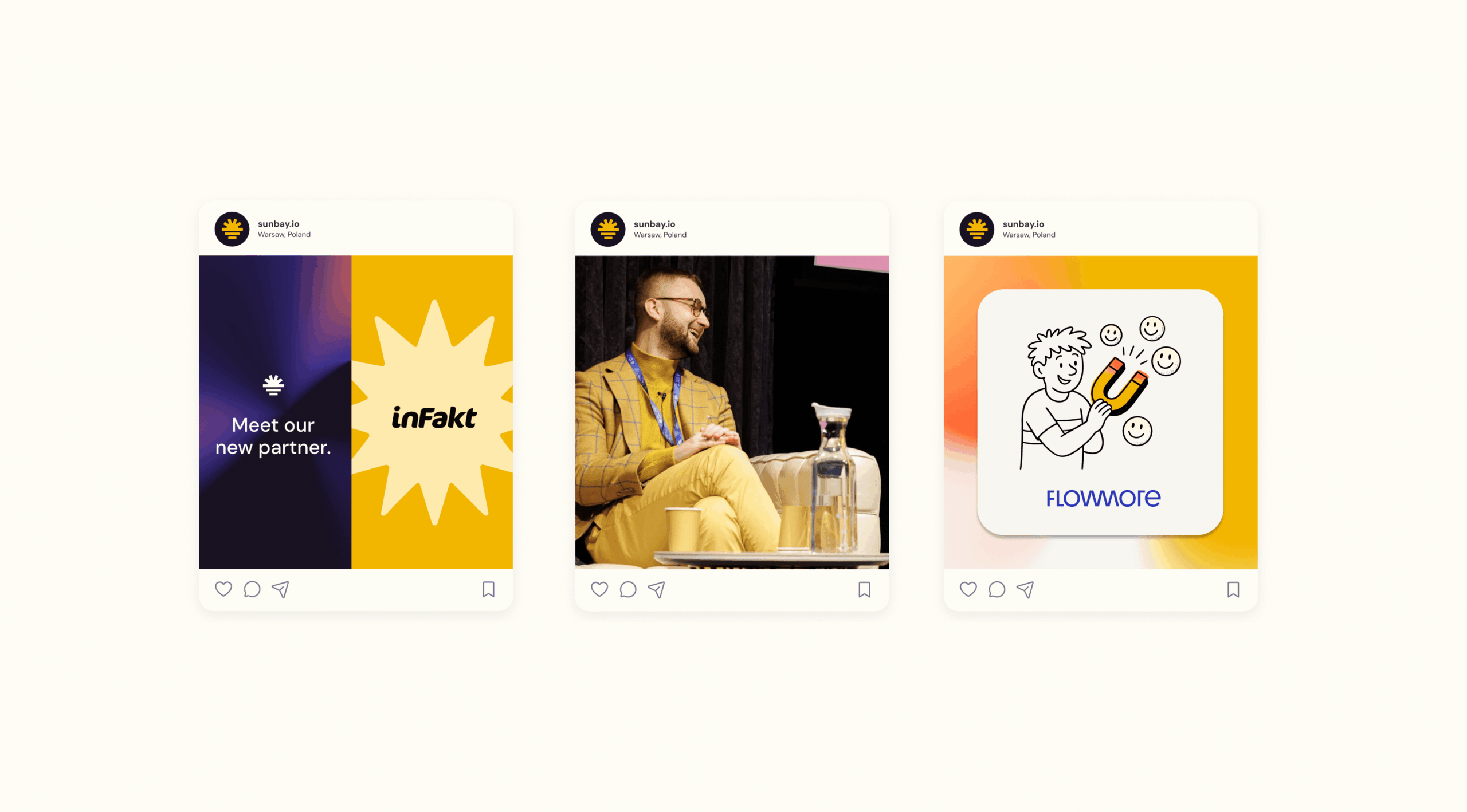
The answer started with strategy. We kicked things off with strategic workshops that laid the foundation for a focused, actionable brand direction. I developed a detailed brand strategy document that helped the team recognize the full scope of their product’s potential—and, more importantly, the emotional needs and expectations of their target users. From there, we moved into design with purpose. The visual identity was built around a bold, character-driven color palette—anchored by yellow. Not just because it fits the “Sun” in Sunbay. No. One of the founders is literally yellow. Check his LinkedIn. I'm not joking. The color became a core expression of his energy and optimism, and a perfect visual anchor for the entire brand. We crafted a tone of voice that was unapologetically clear, direct, and a little playful—something that could joke with the client while still speaking with the confidence of a serious financial product. To reinforce this, we introduced custom illustrations with a lightly comic, goofy flair—adding warmth and approachability to an otherwise weighty topic. The result? A brand that balances credibility with personality, making complex finance work feel lighter, more human, and even fun.
Scope:
→ Art Direction
→ Brand Strategy & Workshops
→ Brand Communication
→ Visual Idenitiy & Brandbook
→ Product UI
Credits & thanks:
Product UX & UI: Magdalena Kuk
Client:
sunbay.io
Sector:
Startup;
Finance & Technology
Date:
June 2025







To start your new project, just drop me a line at jkalicinska@gmail.com
© Joanna Kalicińska ☞ 2015 → 2025